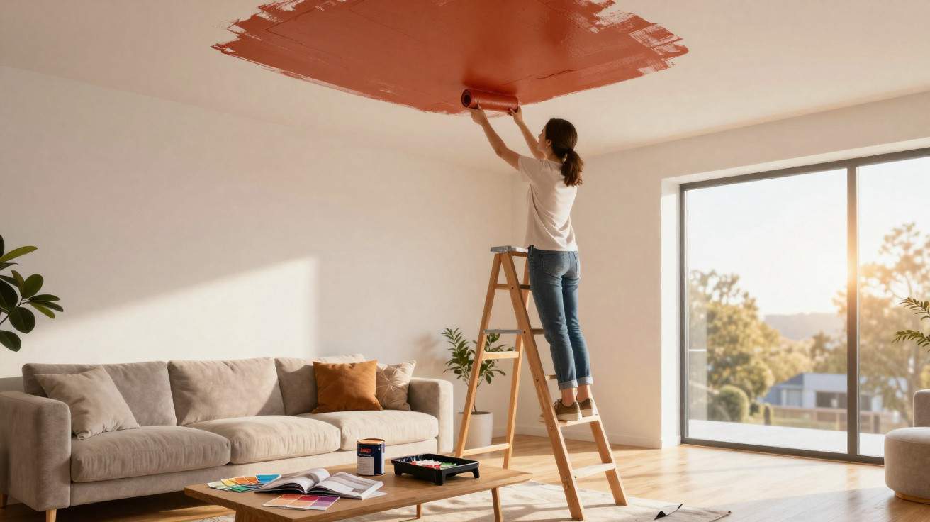
On a Saturday morning, in a flat still crowded with moving boxes, your eyes almost inevitably travel upwards. The walls have just been painted a pale linen shade, the wooden floor has regained its glow, and the sofa finally appears to belong... yet something is still missing. Above the room, the white ceiling remains, so unobtrusive that it begins to feel odd: a vast area the scheme has simply forgotten. We all know that point when a room looks ‘nice’ but never quite becomes memorable. This is often exactly when interior designers look up. The ceiling is no longer merely a neutral backdrop; it becomes a surface for expression, able to warm, expand, cocoon or surprise. The fifth wall can change everything.
The white ceiling is no longer the unspoken rule in our homes
For years, a white ceiling felt reassuring. It seemed to push boundaries away, let the room breathe and ensure no risks were taken. Designers now see it differently: a large expanse of white can also disconnect a room from its atmosphere, particularly where walls are colourful, materials are warm or furniture has a strong design. In a living room in clay-inspired shades, a starkly cool white ceiling can sometimes feel like a neon light switched on in the middle of dinner. Your eye is drawn upwards, and the mood is slightly broken.
In a 42 m² Parisian two-room flat, an interior designer recently selected a rosy brown for the dining-area ceiling, using precisely the same shade as the lower section of the walls. Rather than making the room feel smaller, as the owners feared, it created an almost hushed volume that looked particularly elegant in the evening. According to several paint retailers, searches for “coloured ceilings” have risen sharply in recent years, fuelled by Pinterest and the reworking of compact homes. This is not a trend confined to magazines; it has made its way into real flats.
The idea is fairly straightforward: a ceiling alters how we read a room’s proportions. A deep shade can visually lower a lofty ceiling and make an oversized living room feel more welcoming, while a light yet tinted colour, such as greyed celadon or fresh buttery beige, prevents a clinical effect without weighing the scheme down. The ceiling sets the weather in a room. It can create a feeling of cocooning, freshness, tranquillity or even drama. This emotional influence is exactly what appeals to professionals.
How to choose a colour without turning the room into an enclosed box
The safest approach is to work from elements already in the room: curtains, rugs, the grain of the wood, the sofa colour or wallpaper. Rather than hunting for a striking shade on a colour chart, take a secondary colour and carry it up onto the ceiling, sometimes lightened by 20 to 30%. This visual continuity works especially well in a bedroom or hallway. It makes the whole scheme feel as though it was conceived in one gesture. To test it, paint a large piece of card and look at it in the morning, at midday and under the lamps.
A common mistake is to reproduce a photograph seen on social media without accounting for the actual light in the home. A midnight blue that looks magnificent beneath hotel spotlights can feel heavy in a north-facing living room, while a sunny yellow may turn into a dull beige in a poorly lit space. Let us be honest: hardly anyone really examines their walls at four different times before choosing a tin of paint. Even so, that small effort can prevent regrets and weekends spent repainting. Light determines a substantial part of the final effect.
In low-ceilinged rooms, professionals do not rule out colour; they use it subtly, favouring muted tones and matt finishes. A matt ceiling disguises minor imperfections and avoids reflections that reveal every roller overlap, particularly near windows.
“A coloured ceiling should not be a gratuitous theatrical gesture: it should extend the emotion we want to feel in the room,” the interior designer often explains when presenting samples to clients.
- In a bedroom: choose sage green, greyed blue or a soft dusty pink for an enveloping feel.
- In a hallway: dare to use a denser shade, as you spend little time there and the element of surprise is welcome.
- In a kitchen: pick up a colour found in the splashback, cupboard fronts or pendant lights to establish a visual thread.
- In a very high living room: a medium, warm matt tone can make the space feel more intimate immediately.
The fifth wall: a detail that now tells a home’s story
The coloured ceiling appeals because it brings intention back into spaces that are often standardised. Amid white rental walls, open-plan kitchens that resemble one another and furniture bought in haste, it provides a way to personalise a home without redoing everything. A single coat of paint can frame a dining corner, make a bedroom softer or give a corridor more presence. It is not a magic formula: a dark ceiling in an already busy room can make the whole space feel stifling. Chosen well, however, it delivers that rare impression of a home with its own voice.
There is also a practical side that should not be overlooked. Painting a ceiling means carefully covering the floor, using the right roller and an extension pole, and having some patience for the edges; it is sometimes wiser to call in a tradesperson when mouldings, cornices or ceiling heights make the work more difficult. White remains a beautiful choice in many homes, especially when it is slightly off-white and coordinated with the walls. The point is not to ban it, but to stop choosing it automatically.
Ultimately, this trend says something about what we want today: interiors that are less perfect-for-the-catalogue and more attentive to how we feel when we walk through the door. The ceiling, long overlooked, is becoming a place to try a shade, depth or mood. Some will favour a powdery terracotta in the dining room; others a creamy white that erases the boundary between walls and ceiling. Sometimes, all it takes is looking up in your own room to understand what it lacks. What if the next change were not in front of you, but directly overhead?
| Key point | Detail | Added value for the reader |
|---|---|---|
| The ceiling is a fifth wall | It shapes the perception of height, light and volume. | Selecting a shade becomes a genuine way to alter the atmosphere without major work. |
| Light guides colour | The same paint changes with orientation, time of day and artificial lighting. | Testing a sample prevents a result that is too dark, cold or dull. |
| Continuity calms a space | Repeating a shade from furniture or walls creates a cohesive scheme. | The room feels more considered, warmer and often more personal. |









Comments
No comments yet. Be the first to comment!
Leave a Comment