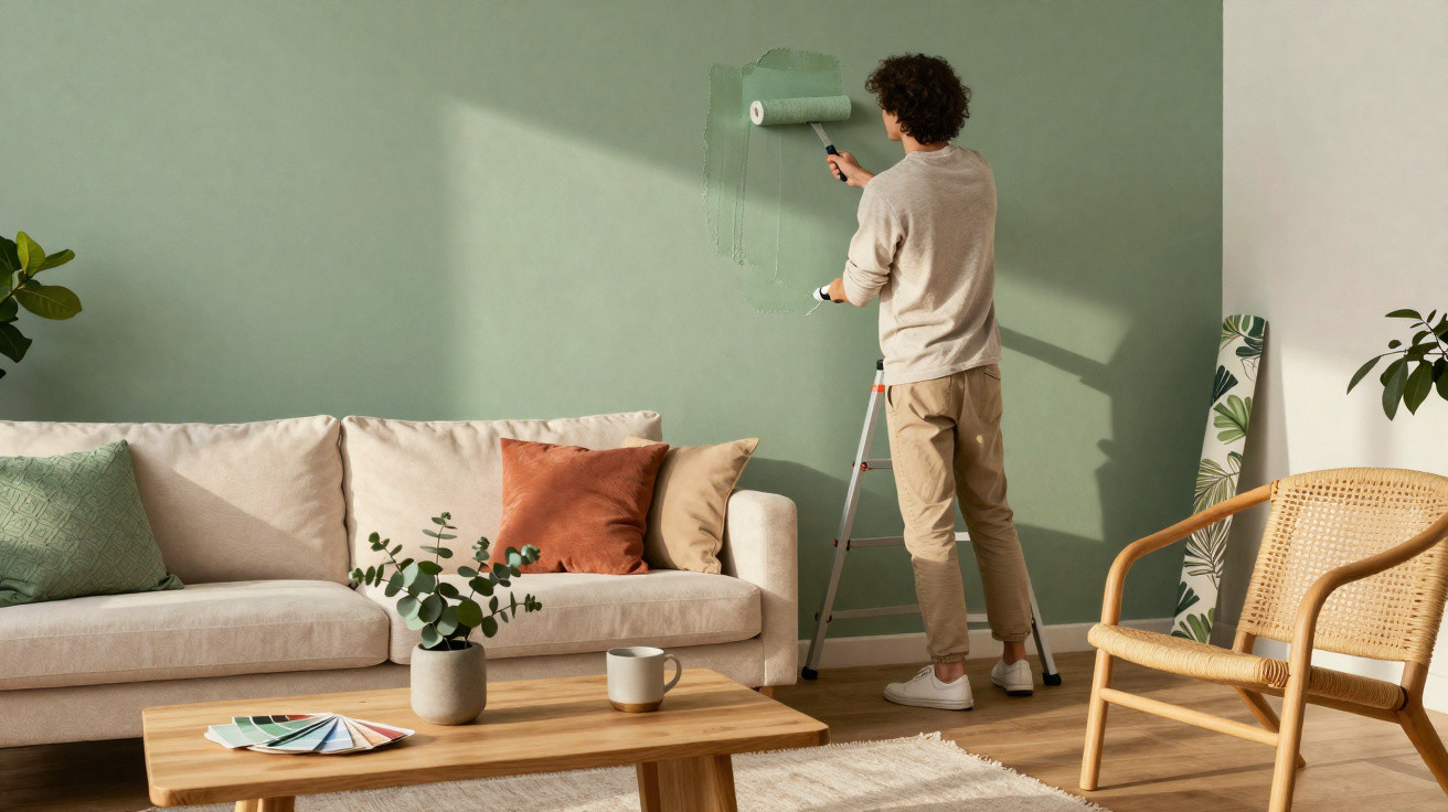
A soft yet confident shade is now moving into the spotlight – and noticeably transforming living spaces.
For years, many new-build homes, period-property lofts and Instagram-ready interiors have followed a similar formula: pale walls, neutral sofas and understated rugs. It is clean, certainly, but often a little uninspiring. For 2026, interior professionals and colour experts are turning to a shade that feels calm, looks contemporary and still has personality: a muted green with a slight grey undertone, commonly known as “Sage Green” or sage green. This colour is becoming the new benchmark for stylish interiors with understated luxury.
Why soft green is replacing white and beige
Home décor trends evolve gradually. First came houseplants, followed by natural materials such as linen, rattan and pale timber. The next natural move is a wall colour that looks like nature and feels restful. That is where sage green comes in.
“Sage green combines the calm of muted grey with the freshness of green – and that is exactly why it works like a reset button for the mind in a living room.”
Where vivid greens can soon feel loud and tiring, sage green stays understated. It brings associations of leaves, herbs and woodland indoors without making a room resemble a nursery or a 1970s interior. At a time when many people work from home and are constantly online, the desire for spaces that encourage a slower pace is growing.
The key strengths of sage green
There are sound reasons why this shade is becoming so prominent. Interior designers repeatedly highlight the same advantages.
- Calming effect: Green shades are proven to reduce stress levels. Sage green is gentle rather than harsh, making it particularly suitable for living rooms and bedrooms.
- Timeless appeal: Unlike short-lived trend colours such as bold coral or neon shades, sage green feels restrained and will still look appropriate in five years’ time.
- Highly versatile: This colour works with almost any style: Scandinavian, minimalist, country house, mid-century or boho. It recedes into the background while still creating a defined accent.
- A gentle alternative to neutrals: Anyone tired of white-painted walls will usually still not want anything dark. Sage green fills that exact gap: subtle, but far from colourless.
Bringing the Sage Green trend into your home
You do not need to renovate an entire room to achieve the effect. Even small areas can make a space feel completely different. The key is to use the colour purposefully and with care.
An accent wall rather than painting every wall
The simplest approach is to paint one wall only. Choose a wall that already draws the eye, such as the one behind the bed or sofa. This gives the room depth without making it feel oppressive.
In compact rooms, a half-height treatment is often enough: sage green below and an off-white above. This visually elongates the room and removes any heaviness from the green. In period homes with decorative cornicing, the shade works especially well on the lower section while the upper area remains light.
Wallpaper as a statement, not simply a backdrop
Anyone seeking more texture will quickly find it in wallpaper. Contemporary sage green designs are a world away from the heavy patterns of earlier decades. Whether you choose a delicate leaf print, a linen-effect finish or geometric motifs, combining colour with texture brings life to neutral spaces.
For example, imagine an otherwise simple living room with a beige sofa, wooden table and light curtains. One wall finished in fabric-effect sage green wallpaper is enough to make the room look as though it belongs in an interiors magazine – without buying a single new piece of furniture.
Accessories for those who want to ease into the look
If opening a paint tin feels too ambitious, begin with textiles and decorative pieces. Typical starting points include:
- sage green cushion covers on a grey or beige sofa
- lightweight curtains in a bedroom or home office
- a rug with a sage green pattern in the hallway
- vases, bowls or plant pots on sideboards and window sills
- bedding that combines sage green with off-white
This lets you see how the shade behaves in your own lighting – and how it makes you feel – before committing to larger surfaces.
Furniture that instantly looks professionally styled
A single item of sage green furniture can become the quiet star of a room. Particularly effective options include:
- a chest of drawers in the bedroom
- a sideboard in the living room or hallway
- dining chairs or a bench in the kitchen
- a low media unit beneath the television
Paired with pale woods such as oak or birch, sage green feels light and modern. Combine it with black metal frames or dark handles for a more urban edge.
Unexpected places for a colour accent
The most interesting results often appear where the shade is least expected. Small areas can make a surprising impact here:
- paint the inside surfaces of shelving
- use it on the back panels of open kitchen cupboards
- colour the recess above the worktop
- paint the inside of doors or window reveals
- use it in a guest cloakroom or narrow hallway
The colour can be more prominent in spaces where you only spend a short time. A small bathroom with white tiles immediately feels more refined and contemporary with one sage green wall.
Colour combinations that make sage green stand out
This shade depends on its partner colours. Certain combinations appear particularly often in interior designers’ projects.
| Colour partner | Effect in the room |
|---|---|
| Off-white, sand, natural white | A very calm, light atmosphere, ideal for bedrooms and small rooms |
| Light grey, anthracite | Crisp, contemporary and slightly urban – well suited to living rooms and home offices |
| Terracotta, ochre, earth tones | Warm, inviting and subtly Mediterranean |
| Gold, brass, warm metals | An elegant, gently luxurious look, ideal for lights, handles and frames |
| Navy, petrol blue | Expressive and sophisticated, better suited to bolder schemes |
“Sage green shows its strengths above all when paired with warm natural tones – the room then feels like a calm retreat.”
Common mistakes with the trend colour – and how to avoid them
Although the shade is easy to live with, there are a few potential pitfalls. A little planning makes them straightforward to avoid.
- Choosing a shade that is too dark in poor light: In rooms with limited daylight, a deeply muted sage green can quickly appear cool. It is worth applying a test patch and, if in doubt, opting for a lighter shade.
- Using too many different greens: Combining forest green, lime green and sage green can create a restless look. It is better to choose one main shade and add only a few very similar variations.
- Using the same colour everywhere: Sage green walls, sofa, curtains and rug can make a room look flat. Contrast is essential – for example through timber, white or warm accents.
Why the trend suits the present moment
Many current interior trends focus on calm, mindfulness and retreat. Open-plan layouts, constant availability and high urban noise levels mean that people increasingly see their homes as places of protection. Sage green is ideally suited to this need for a “soft” home.
The shade also fits effortlessly into sustainable furnishing schemes: it works harmoniously with recycled wooden furniture, second-hand pieces, handmade ceramics and natural textiles such as linen or wool. It is therefore a sound long-term choice for anyone who does not want to completely redesign their home every two years.
Practical tip: finding the right shade for your home
Not every sage green is the same. Some versions lean more towards grey, while others have stronger yellow or blue undertones. A few straightforward steps can help you choose:
- Take home colour charts from different manufacturers.
- Attach sample strips to the wall at eye level, both close to windows and in darker corners.
- Look at the shades in the morning, at midday and in the evening, as light changes their appearance significantly.
- Only start painting when you like the shade by at least 90 per cent – furniture and textiles will take care of the rest.
Anyone who begins cautiously soon realises that moving away from brilliant white and sterile beige towards a soft, elegant green does not feel like a risk, but a relief. That is exactly why sage green has an excellent chance of becoming the new, quietly defining colour for stylish homes in 2026.




Comments
No comments yet. Be the first to comment!
Leave a Comment