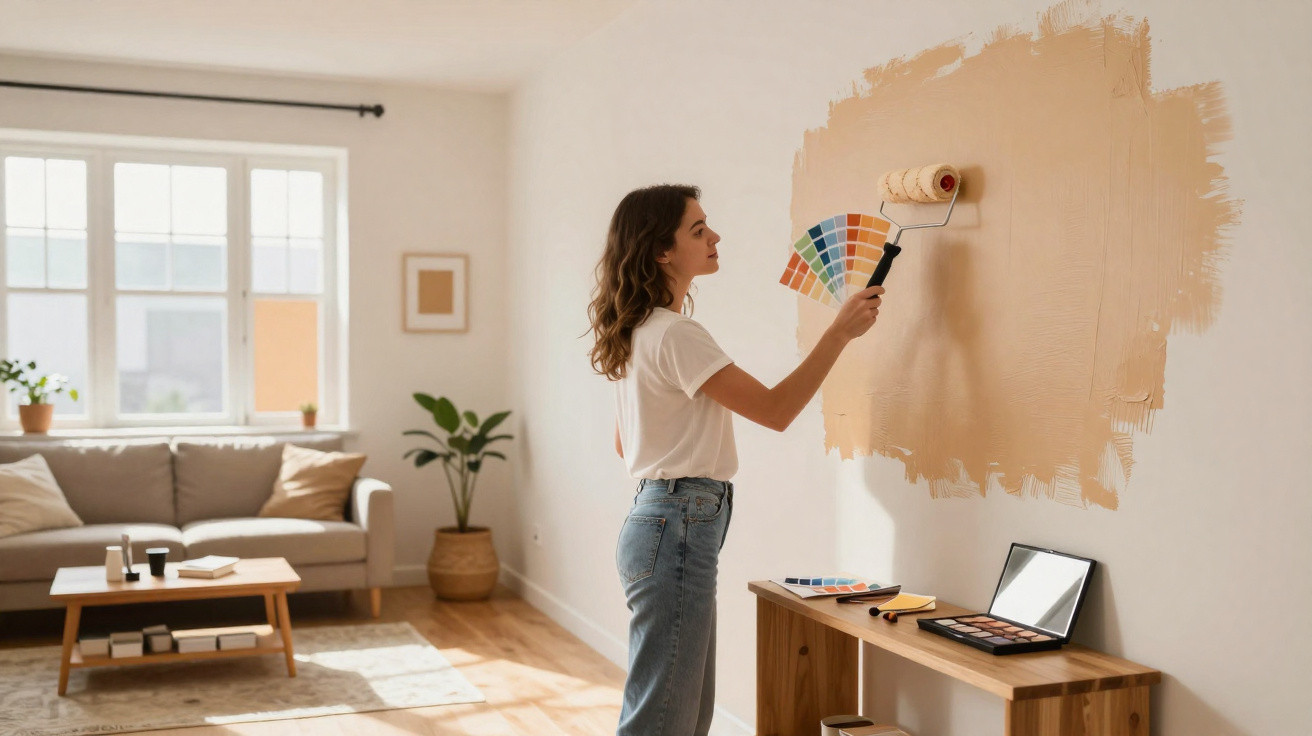
Many homes look perfect in photographs yet feel oddly proportioned in real life: too long, too tall, too cramped or too cold. Rather than immediately planning stud walls or buying expensive furniture, there is a surprisingly simple solution: a painting technique borrowed directly from the world of make-up, using light, shade and contrast.
The principle behind room contouring
In make-up, contouring shapes the face using nothing more than light and dark shades. The same approach can be applied to interiors. Walls, ceilings and architectural features are given deliberately different tones so that the eye interprets the room differently.
The basic principle: dark colours make surfaces appear to recede, while light ones bring them visually forward – allowing proportions to be altered surprisingly dramatically.
Colour specialists such as Helen Shaw of Benjamin Moore explain that the aim is not simply to paint a room “beautifully”, but to use colour strategically:
- position light and dark surfaces intentionally;
- treat ceilings, walls and alcoves differently;
- highlight dominant structural elements or soften their visual impact;
- create a sense of depth rather than adding actual floor area.
You do not gain a single square metre in practical terms. Psychologically, however, the difference can be considerable: a lofty room feels more intimate, a narrow rectangular room less restrictive, and a vast sitting room less like a hall.
Using colour to alter proportions: common problem rooms
Long, narrow room: push back the walls and bring forward the end walls
An overly long living room or hallway can easily feel like a tunnel. A straightforward colour rule helps here:
- Paint the long walls slightly darker so they appear to recede.
- Keep the end walls lighter, making them seem closer.
- Use a neutral ceiling shade, or one that is marginally lighter, so it does not feel oppressive.
This makes the space seem shorter and more balanced. Those feeling bolder can also use an especially warm or rich colour on one end wall – such as a muted red or warm petrol blue – to create a deliberate visual endpoint.
An oversized, cool living room: dark tones create a sense of enclosure
A huge living area with white walls can quickly feel uninviting and echoing. Interior designers often use deeper tones on the main walls in this situation. In one particularly large living room, designer Melissa Oholendt used rich, dark wall colours. The result was a space that felt less sprawling and noticeably warmer.
The ceiling is equally interesting: rather than conventional white, she selected a taupe-grey finish that softened the transition into neighbouring areas such as the hall and dining room. The layout remains open, while each area acquires its own atmosphere.
Sloping roofs and low ceilings: colour as a visual lift
In loft rooms or older properties with particularly low ceilings, people often feel hemmed in. Here, the ceiling plays the leading role. Painting it consistently lighter than the walls removes some of its visual weight. The effect becomes even stronger when the wall colour is extended slightly upwards, leaving a 5 to 10 centimetre band beneath the ceiling in the wall shade. The eye then automatically places the imagined ceiling higher.
Conversely, an exceptionally high ceiling can feel cosier when painted somewhat darker than the walls. Suddenly, the room feels less like a cathedral and more like a living room.
Window walls and bay windows: weakness or focal point
Large windows and bay windows often draw all visual attention towards themselves. You can try to conceal them, or make a feature of them deliberately. Designer Jennifer Hunter chose the latter in a bedroom, giving the bay window area a warm yellow. The effect is clear:
- The eye is naturally drawn towards the window area.
- Pale yellow strengthens the impression of sunlight.
- The depth of the bay becomes more pronounced, making the room seem longer.
Combined with a floral wallpaper pattern, it looks as though a summer meadow begins immediately outside. Similar colour accents can work in less romantic settings too, such as a soft sand shade in a home-office bay or a subtly muted mint around a kitchen window.
The role of matt, satin and gloss finishes
With room contouring, the colour itself is not the only consideration: the finish matters too. Different sheen levels reflect light in very different ways, significantly changing the overall effect.
| Finish type | Effect on light | Best suited to |
|---|---|---|
| Matt | Reflects very little, absorbs light and enhances depth | Large wall areas, corners, rear walls and cosy alcoves |
| Silk matt / satin | A soft sheen with moderate reflection that highlights details | Doors, frames, fitted units, shelving and window reveals |
| Gloss | Strong reflection that emphasises every imperfection | Used sparingly for accents, such as individual mouldings or furniture |
Colour professionals recommend matt or, at most, velvety finishes for surfaces intended to recede or create depth. Gloss products are better reserved for precise highlights – a door in lightly glossy paint, a bookcase with a satin finish, or an emphasised window reveal.
Matt for volume, satin for details, and gloss only as the finishing touch – that keeps a room from looking restless.
Practical colour strategies for everyday living spaces
Narrow hallway in an older property
Long corridors can soon create the sensation of walking through a shaft. One effective idea is to paint the end wall in a rich, warm tone, such as terracotta or deep blue-green. Keep the long walls lighter and more neutral. Painting the ceiling very slightly darker than the walls also reduces the perceived height and makes the hallway feel more welcoming.
Open-plan living and dining space without clear zones
Many new-build flats have one large room for cooking, dining and relaxing. Room contouring can establish distinct areas without partition walls or furniture dividers:
- Give the dining area a coloured wall or alcove to act as a “backdrop”.
- Frame the living area in a slightly darker tone, for instance around the sofa.
- Keep the kitchen lighter so that it does not feel visually heavy.
Painting different ceiling areas in different shades – slightly darker above the dining table and neutral above the sofa, for example – further separates the zones without sacrificing a centimetre of floor space.
Children’s bedrooms and home offices: using colour psychology
Contouring is not solely about surfaces; it also affects mood. A home office benefits from calm, cool tones on the wall behind the desk, while the area behind the camera for video calls can take a warmer, more welcoming shade. In a child’s bedroom, a darker matt colour behind the bed can create the feeling of a protective enclosure, while the other walls remain cheerfully light.
Mistakes that can spoil the effect
For the illusion to work, it is worth making a brief plan before the first brushstroke. Common pitfalls include:
- Too many colours: three main shades per room are usually quite enough.
- Emphasising the wrong surfaces: making an already dominant wall darker only intensifies the imbalance.
- Untidy edges: clean transitions matter, otherwise the room can look patchy.
- Too much gloss: glossy surfaces reveal every imperfection and often undermine the intended depth.
Small paint samples placed in several parts of the room help you assess the lighting conditions realistically. Daylight, artificial lighting and shadows all change perception considerably.
Why this make-up-inspired technique works so well
Our brains constantly rely on shortcuts: light surfaces appear closer, dark ones seem farther away, and contrasts draw the eye almost magnetically. This painting technique makes use of precisely these patterns. Rather than hiding architectural shortcomings, it stages them cleverly and rebalances them with the rest of the room.
Once you understand that colour is not merely decoration but a tool for shaping proportions, you will never look at white walls in quite the same way again. With a few tins of paint, the right matt or satin finish and a little confidence, even “difficult” layouts can appear remarkably harmonious – almost as though a professional has redesigned the room.










Comments
No comments yet. Be the first to comment!
Leave a Comment