Homes are becoming more personal, colourful and sensory. Minimalism is not disappearing, but its look is changing: neutral shades remain, yet they are being challenged by a hue that combines nature, wellbeing and understated style - and is being celebrated as the new benchmark in sophisticated interiors for 2026.
The new benchmark colour: why sage green is replacing white and beige
Anyone furnishing for a ‘clean’ yet chic look in 2026 will no longer automatically choose chalk white or greige. The interior world’s new favourite is sage green: a muted blend of grey and green inspired by the velvety leaves of the sage plant.
“Sage green combines the calm of a spa hotel with the elegance of an art gallery - without feeling cold or sterile.”
This shade is soft, powdery and gently washed-out. It removes the harshness that many white-and-beige interiors have acquired in recent years while adding more personality. Designers describe this as a ‘Soft Colour Shift’: moving away from anonymous minimalism towards a calm colour palette with a story to tell.
Why sage green is becoming the chic shade of the year
Sage green’s growing presence is linked to several shifts: more people work from home, want a sense of calm, but do not want to spend their time in a flat that feels clinical. This is exactly where the shade comes into its own.
- A calming effect: Green tones are demonstrably stress-reducing because they evoke plants, gardens and woodland walks. Sage green acts like a filter between everyday life and a private retreat.
- Timeless restraint: Unlike vibrant emerald or deep fir green, sage green does not shout. It remains subtle without becoming dull - ideal for people who appreciate trends but do not want to repaint every year.
- Highly versatile: It works with natural wood, black, warm earth tones and even intense shades of blue and red. Existing furnishings can therefore usually stay in place.
- A gentle alternative to neutrals: Anyone tired of white and beige but unwilling to choose bright colours will find sage green a pleasing middle ground: lightly coloured yet calm and restrained.
How interiors will look different in 2026
In many projects, sage green is now replacing the traditional white ‘gallery wall’. Rather than clinical clarity, rooms are being given softer definition: lines remain crisp, but the overall atmosphere feels more homely.
| Before | 2026 trend |
|---|---|
| Completely white walls, black accents | Sage green surfaces, off-white, with black metal used only in small touches |
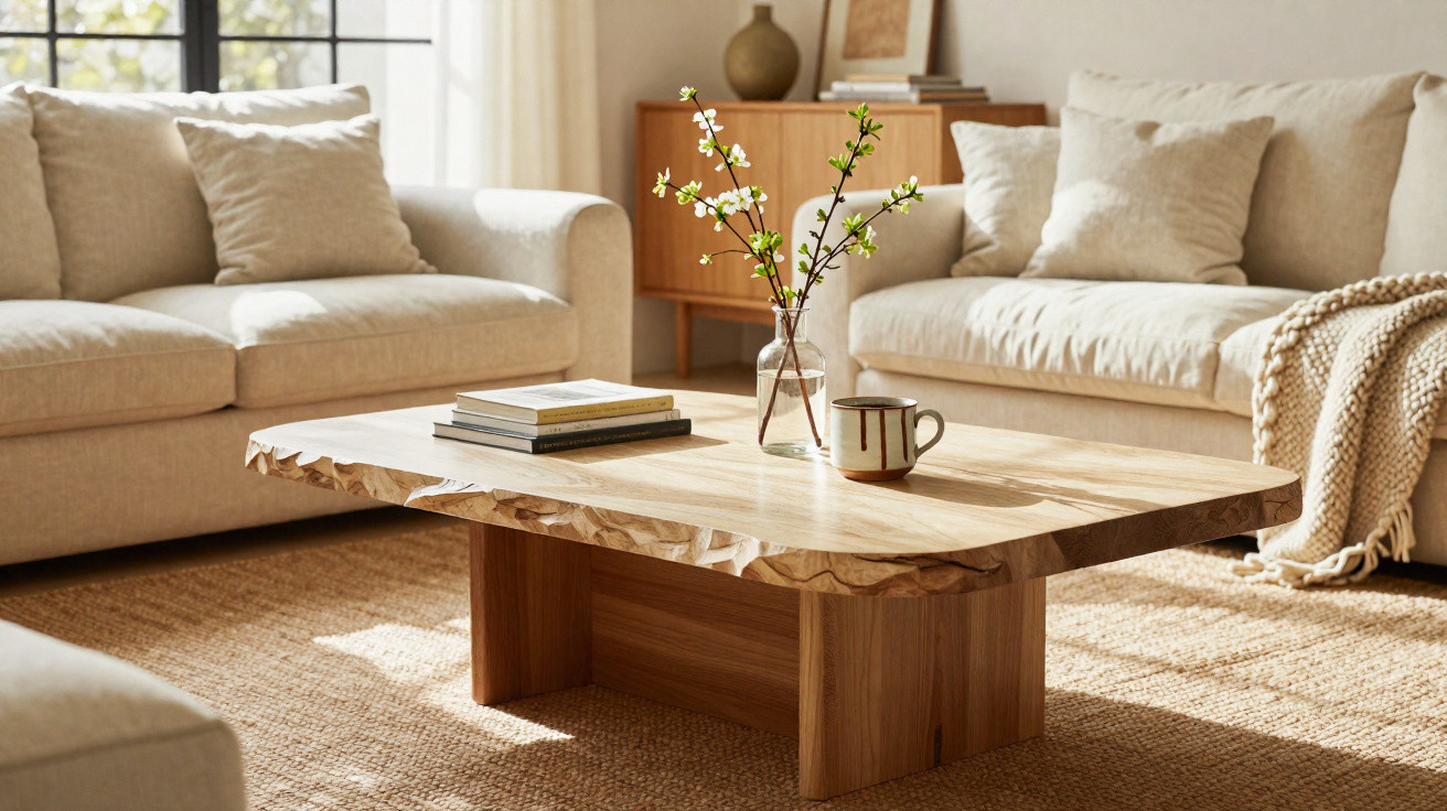
| Beige sofas, a tonal look | A sofa in a natural shade, with sage green cushions and a rug |
| Every room in the same neutral shade | Key spaces - the living room and bedroom - with a sage green focus |
Sage green is particularly effective in compact urban flats, where it works like a breath of visual fresh air. Combined with daylight, it gives a room a light, almost misty depth that many find far more pleasant than the harsh brightness of pure white surfaces.
Bringing sage green into your home without a full renovation
Make a statement with a single accent wall
If a complete redecoration still feels too bold, begin with one section of wall. A sage green feature behind the sofa or bedhead is often enough to transform the mood of the whole room.
“Even one wall in sage green can make it feel as though you are in a new room.”
In small spaces, choose the shorter wall so that the room does not appear compressed. Larger rooms can also benefit from playing with the transition between wall and ceiling, for example by extending the colour a few centimetres onto the ceiling. This visually lowers the height and creates a cosier feel.
Accessories: the no-risk starting point
If you have only recently refreshed your wall colour, use textiles and decorative details instead. Typical first pieces include:
- Cushions and throws in different shades of sage green
- Lightly sheer linen or cotton curtains
- Rugs with subtle green woven patterns
- Ceramic vases, lampshades and picture frames featuring sage green accents
The advantage is that accessories can be swapped with the seasons. In winter, combine sage green with dark teal and brass; in summer, pair it with white and natural fibres such as rattan or raffia.
Sage green furniture: a bold choice with lasting appeal
An increasing number of brands are introducing kitchen units, sideboards and chairs in muted green shades. Matte, slightly powdery finishes are especially popular, as they draw less attention to fingerprints.
A sage green kitchen looks unexpectedly elegant when paired with worktops in pale stone or wood. In the living room, a low sideboard in this colour replaces the classic white cabinet and gives the television area a calmer, less technical appearance.
Unexpected places: the hallway, bathroom and home office
Sage green is particularly effective in spaces where it is least expected. A narrow hallway can feel brighter when its walls are painted in a very pale, greyish sage while doors remain off-white. In the bathroom, the shade can be introduced through tile grout, towels, a shower curtain or the vanity unit.
In a home office, a sage green backdrop behind the desk monitor can ease the strain on the eyes. Many people find long working days noticeably more comfortable when they are not constantly looking at a brilliant white surface.
Which colours pair stylishly with sage green?
Sage green reveals its full appeal alongside other hues. Several tried-and-tested combinations include:
- Off-white and sand: For bright, airy rooms with soft contrast. Ideal for Scandinavian-inspired interiors.
- Light grey and anthracite: Creates an urban, architectural effect and works well with exposed concrete, steel and clean lines.
- Terracotta and earth tones: Adds warmth and removes any hint of coolness from the green. Especially harmonious in a living room or dining area.
- Brass, gold and warm chrome: Introduces glamorous accents without becoming loud. Perfect for lighting, handles and picture frames.
- Deep midnight blue: Creates an almost hotel-like atmosphere. Particularly effective in a bedroom or reading corner.
Common mistakes that ruin the chic effect
Despite its accessibility, sage green can still go wrong. These pitfalls appear repeatedly:
- Choosing the wrong shade for the light: In very dark rooms, a sage that is too grey can look gloomy. Choose a slightly warmer, lighter option instead, and check samples in both daylight and artificial light.
- Using too many different greens: Combining mint, emerald, olive and sage quickly creates an unsettled look. Two, or at most three, shades are usually entirely sufficient.
- Covering the entire room in sage green: If the walls, furniture and textiles are almost identical, the room can appear flat. Wood, neutral colours or metal will bring contrast and life to the scheme.
How to find your own sage green shade
‘Sage green’ is not one strictly defined colour, but a family of similar shades. Some lean more strongly towards grey, while others are warmer, almost with a touch of yellow. A simple three-step approach can help with selection:
- Assess the room’s light: south-facing windows can take cooler, greyer shades, whereas north-facing rooms need warmer versions.
- Look at existing materials: cool stone finishes such as concrete and marble suit cooler sages, while oak and rattan tend to work better with warmer ones.
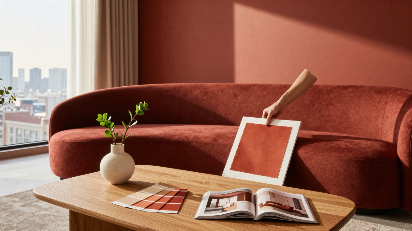
- Apply large samples: test A4 colour cards in several places on the wall rather than relying only on tiny paint chips.
Once people have seen the colour in their own home beside their existing furniture, they rarely return to pure white. Its soft depth acts like a filter that absorbs visual unrest.
Psychological impact and practical scenarios
Colour researchers have traditionally associated green tones with restoration. Especially at a time of constant screen use, a soft green can feel like a break for the eyes. Many interior designers now place this shade deliberately around the sofa, bed or desk.
One possible scenario is a two-room city flat with previously white walls that needs to feel more homely without losing brightness. The living room gains a sage green wall behind the sofa; the kitchen receives only a sage green sideboard and matching stools. In the bedroom, a painted band of wall behind the bed plus two cushions is enough. Material costs remain manageable, while the overall result feels noticeably more premium - almost like a boutique apartment.
For tenants who are not allowed to paint large areas, removable wall panels, fabric wall hangings or folding screens with sage green surfaces are suitable alternatives. This creates the trend-led look without altering the building fabric.
The risks of sticking with the old white-and-beige scheme
There is nothing inherently wrong with remaining strictly within white and beige, but in higher-priced segments there is a risk of looking interchangeable. Many new-build flats now display almost identical colour schemes. Estate agents already report that apartments with subtle yet bold colour accents are more memorable.
Sage green offers a calculated risk here: the colour is seen as refined and calm while also signalling taste and an awareness of current developments. Combined with quality materials such as pale woods, linen and stone, it reinterprets the concept of ‘chic’ for 2026: less strict, less museum-like, and instead more practical for everyday life and closer to what many people truly need - a home that relaxes without becoming boring.

Comments
No comments yet. Be the first to comment!
Leave a Comment