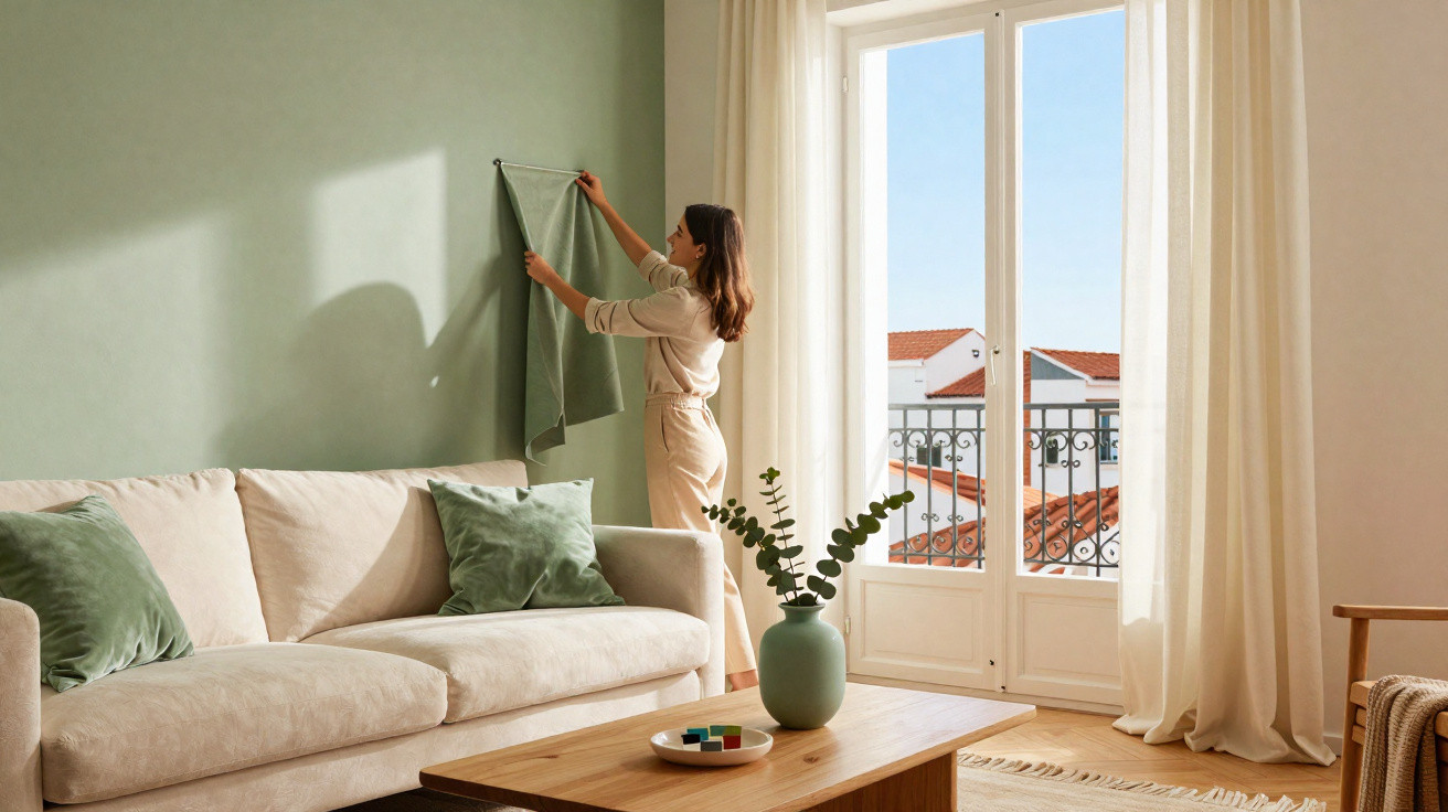
If you want your home to look contemporary and refined in 2026, this colour is difficult to ignore: a muted green shade is replacing the long-standing white-and-beige pairing and is already a favourite among interior designers. It feels calm, expensive and effortlessly stylish at once – and is remarkably easy to introduce without redecorating the entire home.
Why soft sage green is suddenly everywhere
Neutral shades such as white, beige and greige were once considered the safe option. Now, many people want rooms with more atmosphere and comfort while retaining a sense of calm. Sage green delivers precisely that.
“Sage green combines the feeling of nature and wellbeing with the restraint of classic neutrals – making it look instantly premium.”
Sitting between grey and green, the colour recalls the velvety leaves of the sage plant and has a lightly powdery, muted character. This removes any harshness, making it ideal for spaces designed for unwinding: bedrooms, living rooms, home offices and even bathrooms.
The main reasons sage green is becoming so popular
- A calming effect: Green has long been associated with relaxation, restoration and nature. Sage green offers these qualities, but far more subtly than vivid green shades.
- Understated elegance: It works like a refined backdrop – noticeable without demanding attention. As a result, a room looks finished without becoming loud.
- A styling all-rounder: It suits country homes, Scandi interiors, minimalism, boho schemes and modern city flats equally well. A few simple changes can transform the style completely while the wall colour remains the same.
- A softer alternative to white and beige: Anyone who likes neutral tones but has grown tired of them will find sage green an ideal middle ground: restrained, yet full of character.
Bringing sage green into your home without a complete makeover
There is no need to paint every wall or replace all your furniture. This on-trend colour can be introduced gradually, from a cautious first step to an all-in approach.
Feature wall: maximum impact with minimal risk
One sage green wall can completely alter how a room feels. In particularly plain homes, it can look like an instant upgrade.
- Bedroom: A sage green wall behind the bed feels more restful and cosy than white without making the room look dark.
- Living room: Positioned behind the sofa or television unit, a feature wall adds depth and makes furniture appear more luxurious.
- Dining area: A green-toned wall around the dining table and chairs creates a distinct zone – ideal for open-plan layouts.
Wallpaper: texture, pattern and colour in one move
For those wanting more than a smooth painted finish, sage green wallpaper is a strong choice – particularly with subtle patterns, leaf motifs or a fine linen texture. It immediately creates the impression of a considered interior scheme.
Popular options include:
- large-scale, understated botanical motifs in soft green tones
- plain wallpaper with a fabric or linen effect for a boutique-hotel-suite feel
- panoramic wallpaper featuring gentle landscapes or abstract shapes
Wallpaper gives walls and rooms structure without requiring extra decoration. In small city flats especially, one designed wall area is often enough to give a room personality.
Accessories: perfect if you are not quite ready to commit
If you are unsure whether you will enjoy the shade in the long term, begin with smaller pieces. Even in limited amounts, sage green has a surprisingly strong effect.
Typical starter items include:
- cushions and throws for the sofa or bed
- curtains or Roman blinds
- rugs with a greenish undertone
- ceramic vases, bowls and plant pots
- bed linen or bedspreads
“A few well-placed sage green textiles are often enough to make a room suddenly look as though it belongs in an interiors magazine.”
Sage green furniture: a statement rather than a supporting act
Once you have fallen for the colour, bring it into your furniture. Clean-lined pieces and matt finishes, in particular, work beautifully with this tone.
- Sideboard or chest of drawers: Paired with pale timber or brass handles, it quickly takes on the look of a designer piece.
- Dining chairs: Several sage green chairs around a wooden table introduce colour without looking garish.
- Kitchen cabinetry: In a handleless kitchen with a pale worktop, sage green becomes a modern classic.
Unexpected places for sage green
The colour becomes especially interesting when it appears where it is least expected:
- in hallways and entrance areas as a welcoming introduction
- in cloakrooms as a cosy contrast to cool tiles
- in a home office to encourage focus and calm
- on ceilings in small rooms to create an enveloping effect
Colour schemes: tones that work especially well with sage green
One major benefit of this shade is how easily it combines with others. A small number of carefully selected colours can dramatically shape a room’s character.
| Combination | Effect in the room |
|---|---|
| Off-white, sand, light beige | airy, soft, welcoming – ideal for family homes and small spaces |
| Light grey, anthracite | modern, urban, crisp – well suited to lofts, offices or minimalist interiors |
| Terracotta, earthy tones | warm, homely, Mediterranean – works with timber, ceramics and natural fabrics |
| Gold, brass, warm metals | subtly luxurious, elegant – all light sources appear more refined |
| Dark blue | full of character, gently dramatic – ideal for statement walls and reading corners |
Common sage green mistakes – and how to avoid them
Even an easy-to-use trend colour can look challenging when applied incorrectly. Three pitfalls appear in many homes.
- Choosing a shade that is too dark for poorly lit rooms: In spaces with limited daylight, opt for lighter versions or restrict the colour to one wall. Always test paint samples in both daylight and artificial light first.
- Using too many different greens: Combining sage green with bright mint, forest green and khaki can make a scheme feel unsettled. Instead, choose one main green and no more than one second green that is clearly lighter or darker.
- Using one colour for everything: When walls, furniture, textiles and accessories are almost identical in tone, the room can appear flat. Pale neutrals, timber, black or metal accents restore depth.
Practical tips for using sage green in UK homes
Many homes face similar layout challenges: narrow hallways, relatively compact bedrooms and open-plan living-dining spaces. Sage green can help address these deliberately.
- Small bedroom: Paint only the wall behind the bed, then add light bed linen and wooden bedside tables – the result feels peaceful rather than overwhelming.
- Rented home with standard bathroom tiles: Paint or cover the fronts of a vanity unit or shelving in sage green, then add a coordinating shower curtain and rug – and the room will look markedly more modern.
- Open-plan living-dining space: Visually separate the dining area with a green wall zone or wallpaper, while keeping the living area lighter.
What is driving the trend – and how long it may last
Sage green’s success is closely linked to a broader way of living: greater mindfulness, a stronger connection with nature and less coldness in design. Softer transitions are replacing stark black-and-white contrasts. The shade also fits the growing popularity of plants, natural materials, second-hand furniture and handmade ceramics.
Because sage green is not loud and remains close to classic neutrals, it has a good chance of continuing to look current in the years ahead. Anyone who is uncertain should use more muted versions on larger surfaces and rely on accessories, which make it easier to update a look later.
For anyone looking to modernise their home in 2026 without embarking on an extreme colour experiment, this shade offers a rare combination: it feels fresh, calm and grown-up – while finally replacing the white-and-beige monopoly that has dominated for years.






Comments
No comments yet. Be the first to comment!
Leave a Comment