The meeting room appeared flawless on paper.
There was fresh paint, new seating, plants in one corner and an enormous screen fixed to the wall. But as people came in, their shoulders rose, jaws clenched and looks became tense. Nobody could quite say why, yet everyone sensed it: the room was draining.
Its walls were a deep navy, the ceiling stark white, and a severe red door cut across the space by the exit. The lighting reflected oddly, people’s faces appeared more strained, and the room seemed to hum with excessive energy. By close of play, half the team had a headache.
Nothing within the company had altered overnight. Just the colours and the way they had been positioned had changed. That understated detail was controlling the atmosphere.
Why certain rooms make you feel stressed straight away
Enter a room with a low beige ceiling, grey walls and a black television dominating the view, and it can feel as though your body has contracted. Your eyes find no gentle resting place, nothing that feels settled or reassuring. Instead, everything appears to tug your focus in a dozen directions at once.
Colour is not merely decorative; it affects you physically. Large expanses of dark colour may seem to press towards you. Vivid details close to a doorway can prompt a quiet “get out” response. A cool pale-blue wall behind a screen may tire your eyes throughout the day. These reactions are not conscious. Your nervous system simply continues to scan and respond.
One Tuesday afternoon in Lyon, an interior designer invited a family to enter their newly painted living room. The parents immediately stopped. Their children became noticeably louder. What had changed? A solid red wall behind the television and a glossy charcoal ceiling. Within a week, the couple rang back to say they were instinctively avoiding the room.
After the red wall was repainted in a subdued warm clay, with red limited to two cushions and a frame, the atmosphere changed completely. The children played on the rug and the parents stayed at the table after dinner. The furniture, lighting and people were all the same. Yet the room’s energy felt entirely altered. It was not magic; colour placement was quietly shaping how the brain interpreted the space.
Neuroscientists researching what is sometimes termed “visual noise” repeatedly observe this effect. Wide areas of severe contrast require your eyes to make continual tiny adjustments. Highly saturated colours in your direct sightline can increase arousal, which may suit a gym but is less welcome in a bedroom. Even the location of the darkest tone can affect how secure a room feels. Position it above you and the space feels weighty; place it behind your work chair and the room feels more anchored.
Within milliseconds, your brain creates a map: What is stable? Where is the exit? Where can I rest? If that map contains competing cues – dark corners, bright flashes by doorways and restless patterns at eye height – your stress response gradually increases. You may describe it as “bad vibes”. Your body experiences it as overload.
How colour placement affects your nervous system
You do not need qualifications in colour theory to recognise the contrast between a room that embraces you and one that leaves you depleted. Begin with the basics. Consider zones instead of individual walls. Where do you sit? Where do you walk? Where do your eyes settle when your brain needs a brief pause?
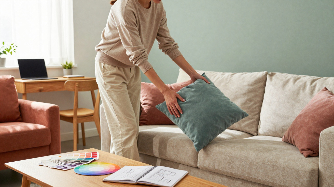
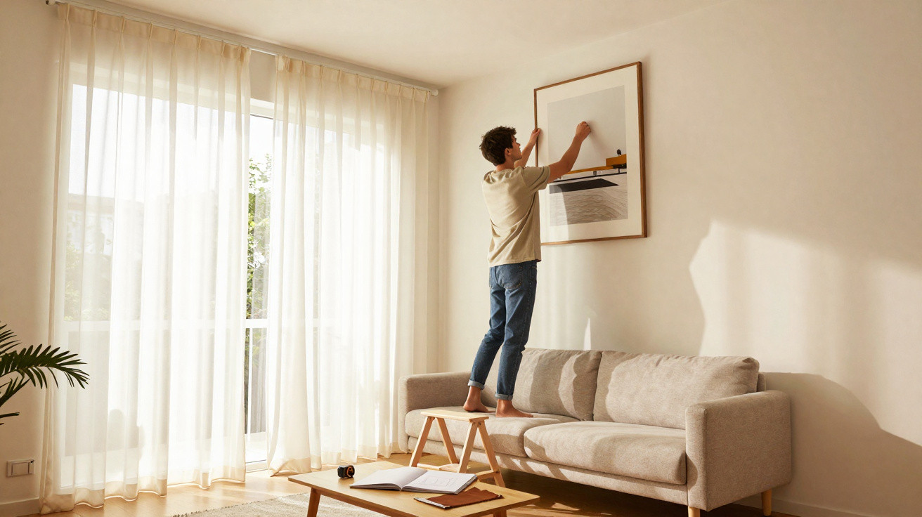
A useful calming approach is to place your gentlest, most muted shades in your main seated sightline. This could be the wall behind your screen, the wall facing your sofa, or the first surface visible from bed. Reserve stronger, fuller colours for smaller elements, such as shelving, cushions, artwork or the interior of a niche. Colour can then still offer character without demanding your nervous system’s attention all day.
Many workplaces repeat the same error: they cover an entire meeting-room wall in a saturated brand colour, often directly behind the screen. It photographs well, but becomes less appealing after three hours of Zoom calls. A London technology start-up replaced its cobalt-blue “statement wall” with a soft greige, retaining blue only on chair legs and storage doors.
Not one policy or workload was changed. Even so, staff said they felt less “amped up” during meetings and found it easier to concentrate. The company’s internal survey recorded a 22% fall in respondents calling the meeting spaces “draining”. That may sound modest, until you consider how frequently people occupy such rooms. Small visual changes, experienced daily, accumulate.
Your brain is programmed to register edges, contrast and movement before anything else. When the boldest shade surrounds doors, windows or corridors, it continually signals transition, pace and “what’s next”. That can work well in a busy café, but it is not especially suitable for a bedroom or therapy room.
Use quieter colours in areas where you want people to slow down, including around sofas, dining tables and reading nooks. Introduce deeper, darker shades lower down, on skirting boards, lower cabinets and rugs, to visually ground the room. Keep lighter colours higher up, particularly on ceilings, to create a feeling of height and airiness. This straightforward principle of light above and depth below can turn an edgy room into a soothing one without altering its layout.
Practical colour placement choices to reduce stress
Start by asking a single question: where should attention rest in this room? In a bedroom, that may be the wall behind the bed or the view visible when you wake. In a workspace, it is the space around your screen. In a living room, it is commonly the wall opposite the sofa. Once you identify that focal point, make it your calm zone.
Select a medium-light, low-contrast shade for this area. Avoid both white and very dark colours; aim for the “quiet middle”. You can be more adventurous around the edges. A dark-green bookcase beside a muted main wall suggests a tranquil forest rather than competing for attention. A terracotta alcove that the eye notices only now and then can add warmth without creating pressure.
At a very human level, everyone is already managing too much. When a home or workplace is visually loud, it adds to the noise in your mind. Soften the wall immediately behind your desk and observe what happens to your tension at the end of the day. Transfer that bright yellow from an entire wall to one lamp and a print, then see whether your evening breathing feels a little easier.
For a hallway wall, try a bolder colour only at hip height or as a stripe above a runner, while leaving the upper section pale. Your body will still register the colour as you pass, but your eyes will not be overwhelmed by it. If you love very dark shades, contain them in smaller areas: inside shelving, at the back of a niche or on a headboard, rather than across the whole ceiling above you.
“Color is like background music for the eyes. You barely notice it when it’s right, but you feel every wrong note all day long.”
A frequent mistake people admit to is painting before living with the choice. They see a colour they love on Instagram, apply it everywhere, then feel oddly overstimulated in their own living room. Another common error is using the darkest shade on the longest wall of a narrow room, making the whole place resemble a tunnel.
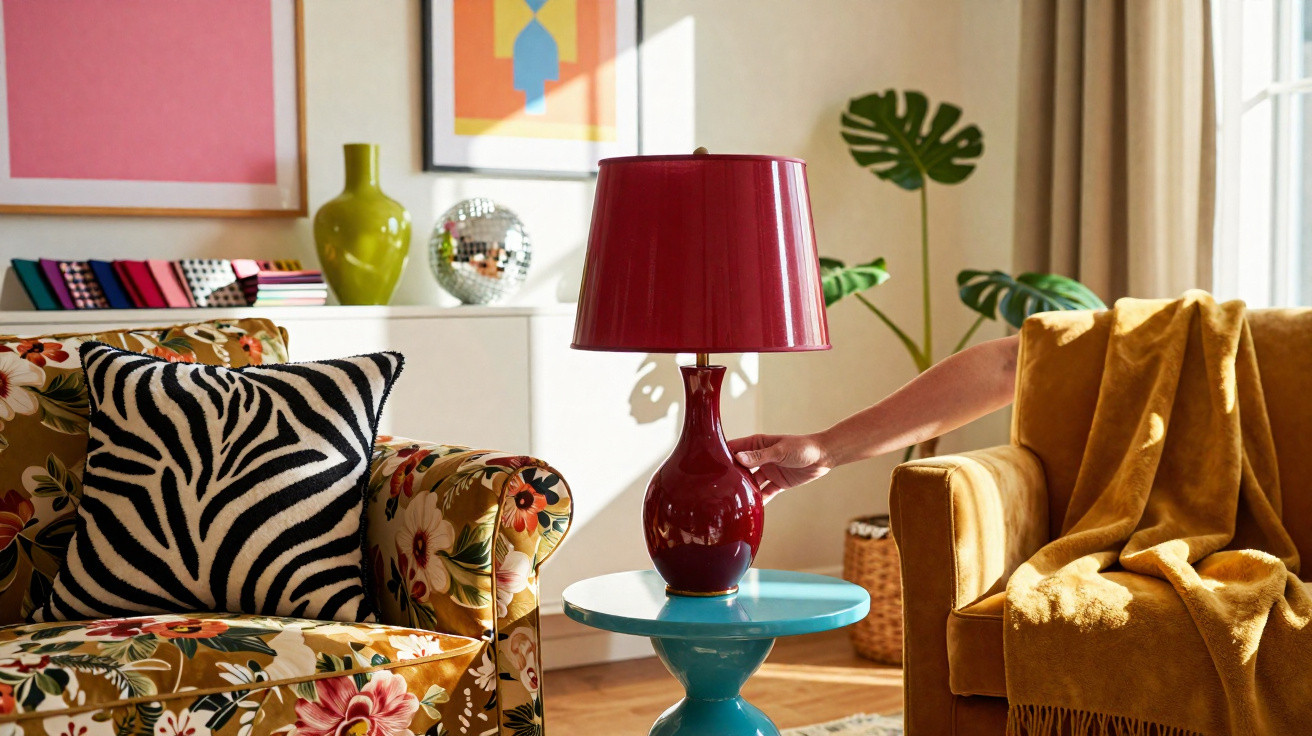
- Trial your boldest colours first on small, movable pieces such as lampshades, cushions or a side table.
- In restful rooms, keep highly saturated shades mainly below eye level.
- Choose gentle, low-contrast schemes for the wall behind your desk or headboard.
- If you often feel unsettled at home, make doors and frames quieter than the walls.
- Alter only one wall at a time, then live with it for a week before painting anything else.
Rethinking the rooms that gradually wear you down
Most people attribute their stress to emails, deadlines, children’s timetables or money. Few blame the glossy red door that seems to shout whenever they pass it, or the black television wall that makes the room feel as if it is being pulled inward. Yet your body takes note of every one of these signals, all day and every day.
When Sunday afternoon finally offers a chance to slow down, pay attention to which rooms you enter and leave most quickly. Notice where your shoulders relax. Then consider the colours again, rather than only the furnishings. Where do your eyes go first? Is that spot gentle or aggressive? Does the ceiling feel like the sky, or like a lid?
The encouraging news is that this is among the few sources of stress you can shift without changing jobs or moving home. A more peaceful ceiling, a softer wall opposite your desk or a darker rug that grounds a floating sofa can sometimes rebalance your nervous system. Quiet colours, placed well, become a form of everyday care requiring no conscious effort.
In practical terms, it is about testing ideas rather than pursuing perfection. Paint a large piece of cardboard and move it around the room. Leave it behind the sofa, then behind the television, then beside the door. Notice where it calms you and where it unsettles you. Let’s be honest: nobody really does this every day, but one small weekend experiment can change how a room feels for years.
We have all stepped into a friend’s home and felt calmer instantly without understanding why. Often, colour placement is doing its gentle work in the background. Once you begin to notice it, you cannot stop seeing it – and you can start guiding your own spaces towards ease, one wall at a time.
| Key point | Details | Why it matters to readers |
|---|---|---|
| Keep the calm colour in your main line of sight | Apply your softest, least contrasting shade to the wall you face most often, whether it is behind your screen, opposite your sofa or in front of your bed. Keep bolder hues for smaller items and side walls. | This reduces visual fatigue and the low-level “buzz” felt after spending hours in a room, while still leaving space for personality and style. |
| Put darker tones low, lighter tones high | Use deeper shades for rugs, lower cabinets, skirting boards and the lower half of walls. Keep ceilings and upper walls lighter and airier. | It creates stability beneath your feet and openness above your head, quietly soothing the body and preventing rooms from feeling cramped or heavy. |
| Move strong colours away from doors and screens | Avoid bright door frames, and do not paint the wall behind your television or monitor in an intensely saturated colour. Choose mid-tones or neutrals for these areas, keeping vivid shades for accessories. | This stops your brain from continually tracking “exits” or glowing rectangles, which may heighten anxiety and make relaxation or concentration more difficult. |





Comments
No comments yet. Be the first to comment!
Leave a Comment