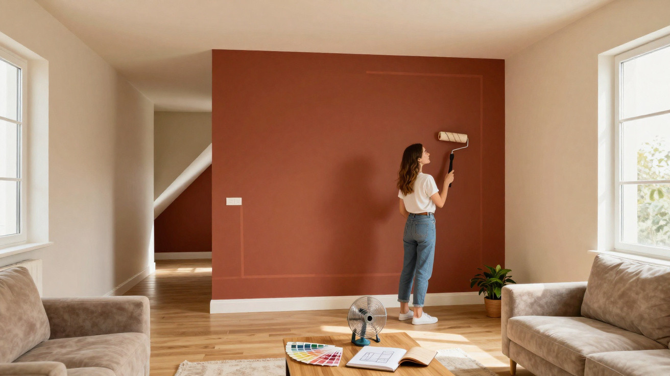
Many homes across German-speaking countries share the same issue: the floor plan works, but the room does not feel right. It may be too long, too narrow, too tall or too cluttered, while major structural alterations would be costly. A distinctive painting technique inspired by make-up contouring now offers a solution: strategically applied colour can visually reposition walls, ceilings and alcoves without moving a single brick.
What room contouring involves
In make-up, contouring shapes the face with light and dark shades. The very same principle is now being applied to interior design. Instead of cheekbones and noses, walls, ceilings and architectural features receive an “optical lift”.
Room contouring means not simply painting beautifully, but placing colour strategically to guide how a room is perceived.
Colour specialists explain it like this: dark shades make surfaces appear to recede and create depth. Light shades seem to come forward and make an area feel larger. The brain interprets these contrasts automatically, so the room appears different even though not a single centimetre has been added.
Using colour gradients, edges and transitions, certain surfaces can be highlighted, while others can be visually narrowed or made to “disappear”. A plain box-like room suddenly gains definition, a long narrow space feels more relaxed, and an excessively high room becomes more inviting.
How colour deliberately tricks the eye
The effect is based on a simple visual principle: our eyes search for contrasts and boundaries. When the brain sees light surfaces beside darker ones, it reads them as being “further away” or “closer”, depending on the shade.
- Dark colours appear heavier, visually recede and add depth.
- Light colours feel lighter, seem to advance and open up the space.
- Soft transitions make edges appear gentler and give rooms a calmer feel.
- Strong contrasts create deliberate focal points and direct the eye.
When used thoughtfully, this approach can make walls seem to move: an overly long wall can look shorter, for instance, or a cramped room can appear more elongated without shifting any furniture.
Solutions for narrow, oversized or awkwardly shaped rooms
A large lounge with a cold atmosphere
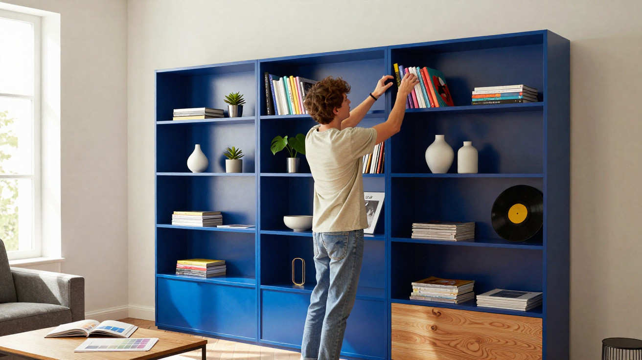
People often feel lost in very large living spaces: there is plenty of wall area, a high ceiling, echoes, and the room can quickly feel like a gallery. Designers often turn to dark wall colours in these settings. Deep blue, green or taupe on the main walls visually reduces the volume and restores a sense of comfort.
There is another effective detail: the ceiling does not have to stay white. A subtly contrasting, muted shade, such as a warm greige, can gently define the transition into neighbouring spaces. This keeps the whole area connected while giving each zone its own atmosphere.
A narrow hallway that seems never-ending
Hallways are among the most common problem areas. They tend to be long, tight and poorly lit. Room contouring can make a genuine difference here:
- Paint the end wall in a darker shade: it appears closer and visually shortens the corridor.
- Keep the long side walls lighter so that they seem further apart.
- Consider making the upper part of the walls slightly darker than the lower section: this gently lowers the perceived height and makes the room feel less tunnel-like.
With only a few colour boundaries, an endless passage can become a more picture-like route that feels far more pleasant to walk through.
A sloping ceiling that feels oppressive
An attic room with a low sloping ceiling can quickly feel cramped, particularly when every surface is painted in the same colour. This approach works well instead:
- Paint the vertical walls in a warm mid-tone.
- Keep the sloping ceiling lighter, drawing the eye upwards and making the room feel airier.
- Define only the line between the wall and slope with a slightly darker shade to add structure without making the space feel heavy.
The result is not an “attic cellar”, but a cosy retreat where people enjoy spending time.
Using architectural details to best effect
Room contouring does more than correct awkward proportions; it can also draw greater attention to distinctive features, such as an ornate ceiling, an archway, a built-in alcove or a large window frontage.
A bay window in a bedroom is one example. Rather than painting it in the same shade as the rest of the room, a warm, light colour can bring its projection forward. The eye is naturally drawn there, the depth becomes more pronounced, and the bay window becomes the focal point.
A bay window framed with carefully chosen colour can act like a natural light source – even on grey days.
The same kind of accent can be used on doors, fitted cupboards or shelving. A door in a satin, slightly darker shade set against a matt pale wall feels like a piece of furniture rather than a purely functional building element.
The role of sheen: matt versus glossy
With room contouring, the colour is not the only consideration: the finish matters too. Its sheen determines how much light is reflected and, therefore, how three-dimensional a surface appears.
| Finish type | Effect on light | Use in room contouring |
|---|---|---|
| Matt | Reflects very little light and appears calm | Ideal for large surfaces intended to recede or gain depth |
| Velvet / satin-matt | A slight sheen with soft reflection | Suitable for walls that need a little liveliness without looking glossy |
| Satin / gloss | Strong light reflections that emphasise every edge | Use only in small areas for details that are meant to stand out |
Experts recommend predominantly matt or velvety finishes for the actual “modelling” of a room. They absorb light, strengthen shadows and soften the appearance of corners and edges. High-gloss paints, by contrast, reflect strongly and may undermine the illusion by making every imperfection stand out.
How to plan your own room contouring
Before applying the first brushstroke, it is worth looking at the room as you would a face in the mirror. Which areas should recede, and which should come forward?
- Choose your viewpoint: Assess the room from the position it is most often seen from, usually the entrance or the sofa.
- Identify problem areas: Look for an overly long wall, a ceiling that feels too high, a tight corner or a bulky feature.
- Define the “highlights”: Select windows, alcoves, fireplaces or shelving walls that can be emphasised.
- Pick colour pairs: A light shade and a clearly darker shade from the same colour family will look harmonious.
- Decide on the sheen: Use matt for surfaces, reserving satin or gloss for details only.
Test strips or small sample areas in different positions will quickly show whether the intended effect is working. As light changes throughout the day, it is best to assess paint samples in both the morning and evening.
Common mistakes and how to avoid them
As with make-up, it is possible to overdo room contouring. Several pitfalls appear time and again:
- Too many contrasts: Giving every wall a different strong colour creates a restless, tiring effect.
- The wrong focal point: Darkening the wrong wall can make the room feel even narrower.
- Sheen in the wrong place: Glossy paint across large surfaces draws attention to every uneven area of plaster.
- Ignoring daylight: A shade that looks excellent in a north-facing room may appear harsh in a south-facing one.
Anyone who is unsure can begin with small areas: a reading corner, a short stretch of hallway or a single wall projection. The learning value is high while the risk remains low.
Why this method is so popular right now
Room contouring is well suited to a time when many people want to improve their homes without extensive building work. The technique:
- costs little compared with renovations,
- can be carried out in stages,
- works in rented homes because everything can be painted over again,
- allows for individual solutions for very different floor plans.
In addition, colour affects more than appearance; it also changes how a space feels. A well-modelled room often seems calmer and more clearly organised. It is easier to navigate and feels more like “home”, even when the floor plan is far from ideal.
Those willing to try it soon discover how powerfully a few graduated shades can influence the mind. With a little confidence and a paintbrush, many unloved rooms can be transformed into surprisingly harmonious favourite spaces.














Comments
No comments yet. Be the first to comment!
Leave a Comment