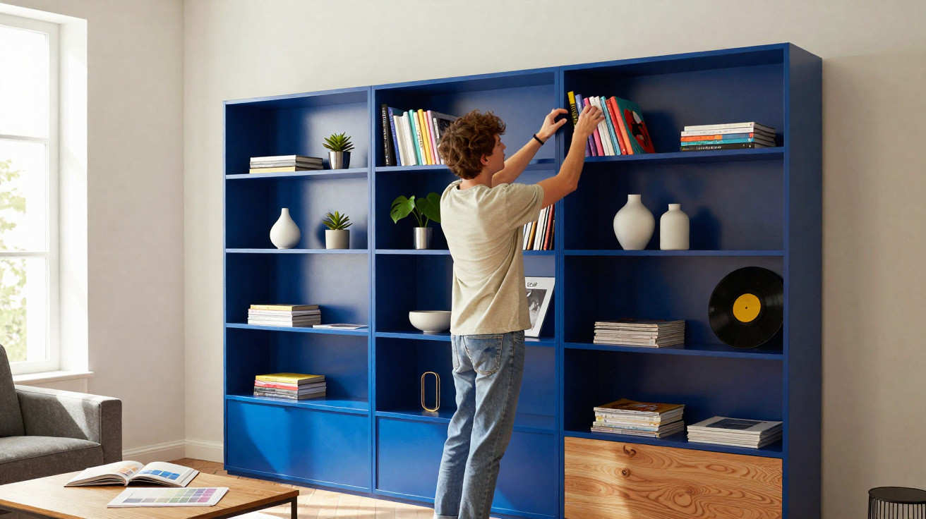
For decades, BILLY has been a familiar sight in living rooms, student flats and offices – usually in understated white or a wood-effect finish. IKEA is now taking an unusually bold step: the shelving unit is arriving in a rich cobalt blue, recalling the iconic architectural colours of North Africa and giving this long-standing favourite an entirely new visual identity.
Why BILLY is getting a colour statement now
BILLY is the shelving equivalent of the Volkswagen Golf: everyone knows it, and almost everyone has owned one at some point. It works in the smallest spaces, can be extended as needed, remains affordable and avoids unnecessary fuss. That very simplicity has made it a standard choice for budget-friendly homes.
Its success, however, also comes with a downside: in many homes, BILLY has begun to feel interchangeable. A white or pale shelving unit against a white wall can almost disappear into the background. At a time when interior trends increasingly favour colour, statement pieces and Instagram-ready spaces, being “functional and neutral” is no longer enough on its own.
“With the new cobalt-blue version, IKEA turns a mass-market product into a visual statement – without exceeding the budget of an everyday piece of furniture.”
The thinking is straightforward: the furniture giant wants to demonstrate that a familiar standard shelving unit can offer more than storage. It can also bring atmosphere and character into a room, without requiring a full renovation or an entirely new furniture suite.
The new shade: what defines the cobalt-blue BILLY
The latest BILLY comes in a deep cobalt blue that evokes the bold architectural shades seen in Moroccan cities. This is not a pastel “nice-to-have”, but a rich, intense colour with a clear impact on a room.
How cobalt blue works in the home
Cobalt blue has a distinctive presence. Depending on the colours and materials paired with it, it combines coolness and elegance with a certain warmth. In interior design, it is regarded as a strong choice for encouraging calm and concentration without becoming dull.
- In the living room: The unit becomes a visual focal point, particularly against pale or beige walls.
- In the home office: Blue supports focus, while books and files stand out clearly.
- In the bedroom: Used as a single piece against a calm wall, it feels soothing rather than overpowering.
- In the hallway: It creates a narrow, tall accent that lifts otherwise uninspiring transitional areas.
The shade is less suited to a “light Scandi romance” look and more at home in confident interiors: urban, modern and slightly artistic. Anyone who has previously relied on white has the opportunity here to transform the mood of an entire room with one item of furniture.
A familiar shelving unit with a new look
In practical terms, BILLY remains what it has always been: a tall shelving unit with adjustable shelves, available in different widths and heights. The cobalt-blue version follows the same dimensions as established variants – around 40 x 28 x 202 cm in one format currently listed in North America.
This gives IKEA a clear advantage: anyone who already owns BILLY shelving can incorporate the new colour with ease. Old and new units can stand side by side without disrupting the overall look. The most interesting result comes from contrast – for instance, when one blue unit breaks up a run of white shelving.
“Rather than refurnishing an entire room, a single coloured element is enough to make a familiar living room feel fresh.”
Who will benefit most from the cobalt-blue BILLY
The new version is likely to appeal to several groups:
- Book lovers who want to display their collection deliberately, as if in a gallery.
- Fashion enthusiasts who showcase shoes, bags or accessories openly – cobalt blue creates a striking backdrop.
- People working from home who need an eye-catching yet professional background for video calls.
- Tenants with no scope to redecorate, where colour must come primarily from furniture rather than walls.
Price, availability and a small catch for German fans
There is one catch: so far, the cobalt-blue BILLY has appeared mainly in international stores, including Canada and Spain. Depending on the country, it is priced in the usual BILLY range, meaning it costs considerably less than designer pieces that would create a similar effect.
While customers in North America and southern Europe can already buy one, shoppers in German-speaking markets are still waiting for an official launch date. Those unwilling to wait have three relatively demanding options:
- Ordering through friends abroad who can forward the shelving unit.
- Collecting it personally while on holiday, for example from a Spanish branch.
- Looking for imported listings through third-party sellers – though these may involve mark-ups.
The company has not yet said whether or when the model will officially arrive in Germany, Austria or Switzerland. Experience suggests, however, that successful trend colours often reach further markets after some time.
How to combine the blue BILLY with style
Anyone adding cobalt-blue shelving to their interior should keep a few basic principles in mind. If used incorrectly, the colour can quickly dominate a room.
| Interior style | Suitable combinations | Less suitable |
|---|---|---|
| Light Scandi | Plenty of white, pale wood, linen, natural-fibre rugs | Too much black, vivid neon colours |
| Industrial | Black metal, exposed concrete, grey walls | Playful floral patterns |
| Boho | Rattan, terracotta, mustard yellow, warm earthy shades | Cool high-gloss white across large areas |
| Minimalist | Few colours, clean lines, plenty of clear wall space | Too many decorative items in a tight space |
The depth of the shade also has a practical advantage: books, plants and vases appear more three-dimensional. Light-coloured book covers and glass objects stand out particularly well. Used as a shoe display, the shelving unit creates an almost museum-like effect, especially with pale trainers or high heels.
Why colourful classics are on trend
With this move, IKEA is following a wider trend: rather than designing completely new models, many manufacturers are releasing familiar, proven furniture in strong colours. This reduces production risk while also creating buzz on social media.
For customers, this brings several benefits:
- Predictable quality: You already know how the furniture works because it has been available for years.
- Easy coordination: Existing furniture ranges can continue to be used; only the appearance changes.
- On-trend without a full makeover: One item is enough to make a room feel more contemporary.
One risk remains: strong colours can feel “over” more quickly than neutral shades. Anyone uncertain should begin with one piece – which is exactly why a shelving unit such as BILLY is well suited. It can later be moved to another room or sold on if personal tastes change.
Tips for anyone who does not want to wait for the blue version
Until then, many fans of the classic in German-speaking markets are using a workaround: they buy a neutral BILLY and give it their own finish. Furniture wraps or specialist paints are suitable for this. Careful surface preparation is essential, otherwise the paint can quickly chip when the shelves are loaded.
Those prepared to do it themselves can experiment with shades close to cobalt: deep midnight blue, velvety petrol blue or an almost electric ultramarine. The outcome remains similar – a calm room with a strong vertical accent of colour. For rented homes, it is a relatively low-risk option: when moving, the unit can simply be swapped for a neutral version or sold along with other furniture.
Above all, this move by IKEA shows one thing: even the most recognisable standard shelving unit does not have to remain boring. A powerful shade such as cobalt blue is enough to turn a practical mass-market product into a piece of furniture people talk about – and one that stands out instantly in photographs.












Comments
No comments yet. Be the first to comment!
Leave a Comment