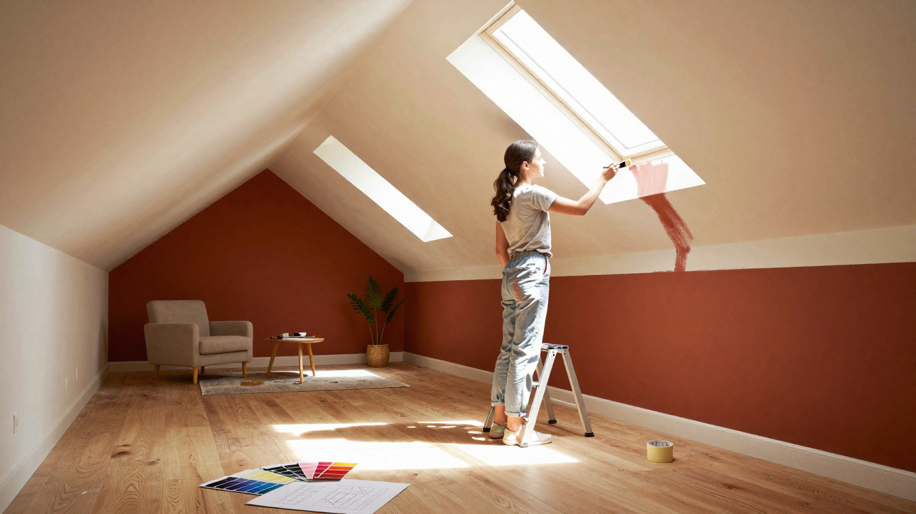
Interior designers are increasingly turning to an unexpected tool: make-up techniques applied to paintwork. Carefully placed light-and-dark contrasts can dramatically alter how a room is perceived - without a sledgehammer, stud walls or replacement furniture.
The principle behind Room Contouring
Contouring has long been a staple of the beauty world: darker shades make parts of the face recede, while lighter ones draw attention to cheekbones and brows. The same approach is now being brought into interiors. Professionals call it “Room Contouring” - shaping a room through colour.
“The idea is not simply to paint beautifully, but to paint strategically - with a clear purpose for every surface in the room.”
Rather than covering everything in one neutral shade, designers use graduated tones across walls, ceilings, alcoves, mouldings and architectural details. This creates intentionally placed effects of light and shadow that guide the eye. The room’s physical dimensions remain unchanged, but the way we experience them can shift considerably.
Dark areas appear to recede, whereas light ones seem to advance. This can be used to visually “correct” proportions: an excessively tall space can feel lower, a long narrow room can appear wider, and an oversized living area can become more intimate.
How colour deceives the eye
The technique is based on how we perceive light and depth. Pale surfaces reflect more light, making them feel closer and more prominent. Darker finishes absorb light and appear more distant. This straightforward principle can be applied deliberately:
- Dark shades make a surface seem to retreat and create depth.
- Light shades bring a surface forward and make it appear larger.
- Mid-tones connect the two effects and provide gentler transitions.
No one gains actual square metres this way. However, the feeling of entering a room can change enormously. A space described as “too cramped”, “too cold” or “too awkwardly shaped” can often feel “balanced” and “coherent” solely because of the chosen colours and where they are used.
Typical problem rooms: too narrow, too large or too complicated
A long corridor or narrow room
Many homes have corridors that feel like tunnels, or living rooms that stretch almost entirely in one direction. Room Contouring is particularly effective in these situations.
- Paint the short end wall darker: It will appear closer, reducing the tunnel effect.
- Keep the long walls lighter: They recede visually and feel less overpowering.
- Slightly darken the ceiling: A shade only marginally darker than the walls makes the ceiling feel lower and softens the long, narrow character of the space.
The result is a corridor that feels more compact and less endless. In rooms with a window at one end, it can work well to frame the window wall in a slightly darker shade, allowing the bright window itself to shine more strongly.
A vast, somewhat cool living space
Large, open-plan living areas may be considered desirable, but in practice they can quickly feel uninviting. Extensive bare wall space, high ceilings and little structure can leave people feeling lost within them.
Interior professionals often select deeper wall colours to give these rooms visual weight and a sense of comfort. A richer shade on the main walls subtly reduces the apparent scale of the room and makes it feel calmer. A slightly different ceiling colour can also separate areas, such as the living and dining zones, without the need to build a partition wall.
“Dark walls do not have to create a ‘cave effect’ - used properly, they give large rooms definition and character.”
Anyone hesitant to commit to fully dark walls can begin by deepening just one or two surfaces, such as the wall behind the sofa or the wall opposite the incoming light.
Sloping ceilings, low ceilings and awkward alcoves
Bedrooms beneath sloping roofs and period properties with very low ceilings can soon feel oppressive. Here, the reverse approach is useful:
- Make the ceiling and slope noticeably lighter than the walls: This makes them seem to lift upwards.
- Use slightly stronger shades on the walls: They provide visual grounding and allow the pale ceiling area to appear to float.
- Darken distracting alcoves: Giving them a darker treatment pushes them back visually, making them less conspicuous.
A room that previously felt like an upside-down box can become a far airier space with clearer lines.
Using architectural features to best advantage
Room Contouring is not only about disguising features; above all, it can be used to celebrate them. Some elements deserve attention, including an attractive bank of windows, an old fireplace or an elegant door.
A popular method is to paint these features in a lighter, warmer colour than the rest of the room. A bay window or window frontage can feel like a light source in its own right when given a sunny tone. The eye is naturally drawn there, the room’s depth becomes more apparent, and a focal point is created at the same time.
“What was once considered a ‘problem area’ becomes the star of the room with just a few brushstrokes.”
Bookcases, fitted cupboards and wide door frames can also be brought forward in this way. Those willing to be bolder can use complementary colours - shades that intensify one another - such as a muted blue on the walls paired with warm sandy beige around the windows.
Matt or gloss: the effect of the right finish
A convincing Room Contouring scheme requires more than a good colour selection. The finish has a major influence on whether the effect succeeds.
- Matt paints reflect very little light. They absorb brightness and create depth, making them ideal for surfaces intended to recede, such as a television wall, the end wall of a corridor or a reading corner.
- Velvety finishes work in a similar way, but have a softer, more premium appearance.
- Gloss and high-gloss paints reflect substantial light, highlight every edge and can make surfaces appear flatter.
Interior designers therefore tend to use matt finishes on larger surfaces that are meant to be shaped visually. Glossier options are better suited to details intended to stand out, including doors, decorative mouldings, individual pieces of furniture or a painted bookcase.
“The basic rule: create depth with matt finishes and set accents with gloss.”
Practical ways to start with Room Contouring
Anyone trying the principle for the first time should begin on a small scale. A few straightforward applications work in almost every home:
- Visually widening a room: Paint the end wall of a narrow room slightly darker and keep the long walls lighter.
- “Lowering” a ceiling: In very tall rooms, paint the ceiling and upper third of the walls darker, while retaining a lighter shade below.
- Zoning areas: In an open-plan living-dining space, frame the dining area with a deeper tone and keep the sofa area calmer and lighter.
- Creating a small reading corner: Paint an alcove and the adjoining ceiling in a dark matt shade, leaving the remaining space neutral.
This makes it possible to test how strongly your own perception responds to colour placement - usually more than expected.
Risks, mistakes and how to avoid them
Room Contouring can, of course, go wrong. Applying dark areas at random risks creating an overall scheme that feels oppressive and unsettled. A clear objective is crucial: what should look smaller, larger, calmer or more prominent?
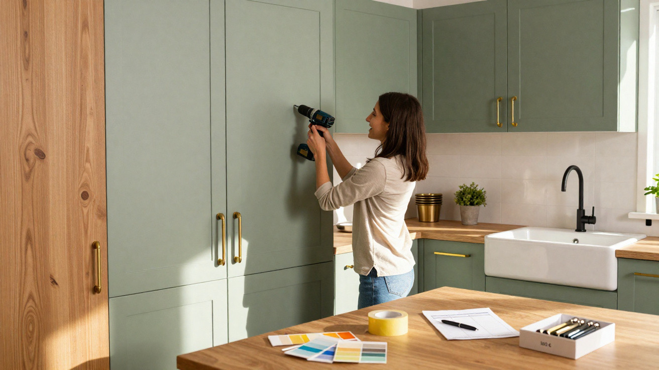
One simple method is helpful: before painting, mark out individual areas with masking tape and coloured paper, or use image-editing software to apply colours virtually to a photograph of the room. This will reveal whether the concept looks convincing. Two or three closely related colours will generally feel more harmonious than five entirely different shades.
Why the effort is worthwhile
Compared with new furniture, stud wall construction or an elaborate lighting scheme, Room Contouring is remarkably affordable. A few tins of paint, some time and a well-considered plan are enough to noticeably transform the feeling of a room. It is especially valuable in rented homes, where structural alterations are rarely possible, because the technique offers an unusual opportunity to “repair” proportions.
By working gradually, you learn something with each room. Terms such as depth effect, light reflection and colour temperature may sound abstract at first, but they quickly become tangible when experienced in your own home. Ideally, the outcome is an interior that is not perfectly symmetrical, yet feels exactly right - simply because colour has skilfully applied its make-up.















Comments
No comments yet. Be the first to comment!
Leave a Comment